(Back from wine tasting to finish this response to your question regarding dye inks ...)
The short answer is that although the dyes have some amazing visual advantages on some papers, if you are accustomed to carbon print longevity and want something that will last a long time, avoid the dyes. They are great for cards and short term display, but not really what I think of as "fine art" quality.
The longer answer:
I think B&W dyes on metallic paper have a visual "pop" to them that is beyond any other B&W medium I've seen. Frankly, they are the only B&W medium that I've had great success with in selling on the same wall as bright color paintings. The mixed media shows I most often participate in are in the front room of Gallery Los Olivos, where we have lots of daylight (which means a good spectrum and lots of UV to light up the OBAs in the paper).
Based on the success with selling in the front room with the dyes on metallic paper, I did an entire show of them in the front room of the gallery in September of 2013. It was a great success. Not all of the prints sold immediately. In fact the last one of them just "sold" this last week. I had moved it from the front room to a different wall that was lighted with LEDs and lacked the daylight (UV for the OBAs).
In general, dyes have much more "metamerism" or color inconstancy with less than perfect lights. Even though the Claria/Noritsu dyes are much better in this respect than many dyes, with typical fluorescent lights I never thought they were acceptable at all. While LEDs are considerably better, they are not perfect, with a CRI in the mid 80's.
So, back on the interior wall, I had this "old" dye print from 9/2013 next to some new ones. The new ones were made with a revised inkset that used more color ink in an "ABW" mode type of profile to help with the rather fast warming that the black only dyes experience.
Bottom line, the dye prints warm up (turn brown) relatively quickly, particularly if they use only the black ink.
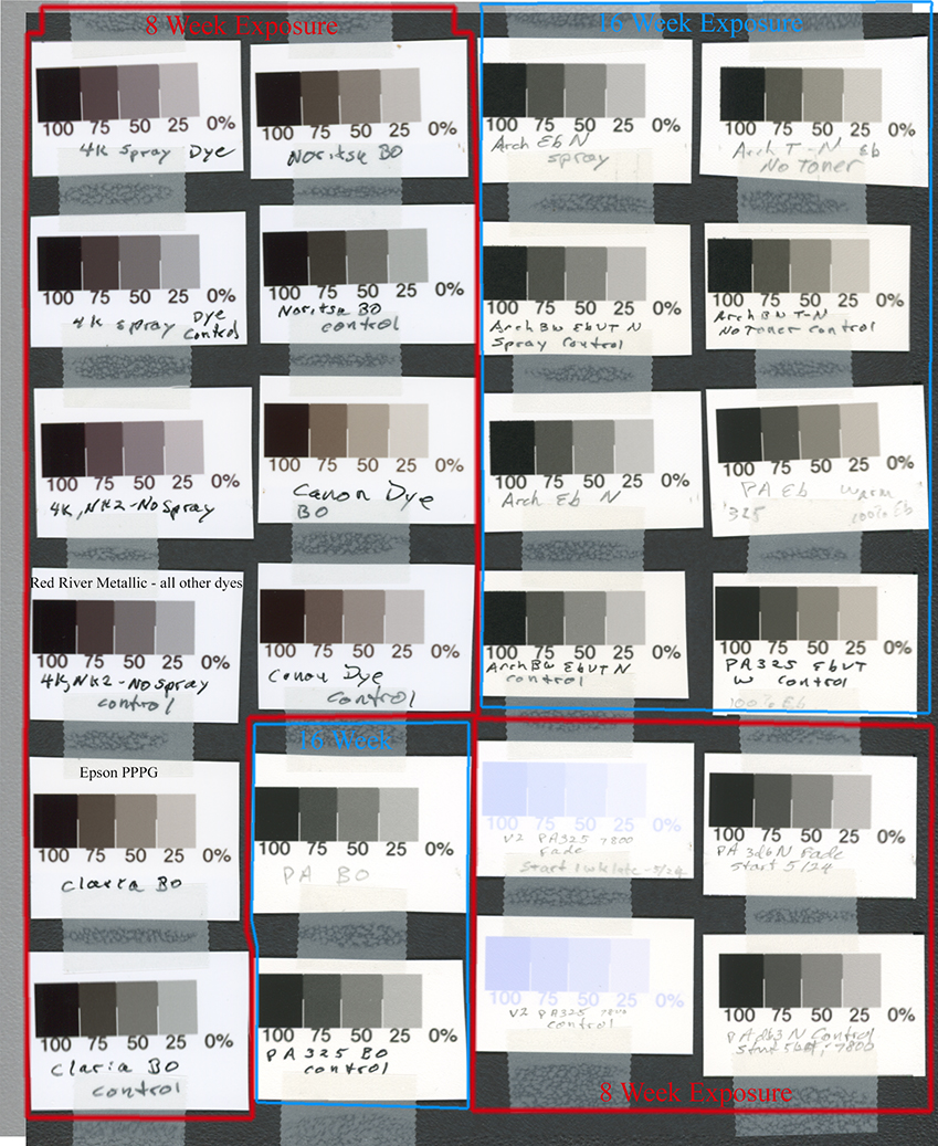
As noted above, the change I made in my dye printing (using an old Epson 4000) was to go to a "ABW" type of profile. The colors are more lightfast than the black dye ink (a reversal of the situation with pigments). Compare the Noritsu dye (same as Claria) BO test at the top of the second column with the "4K" test strips that are the two pairs at the top of the first column. (The "4K" test strips are Noritsu dyes printed with the Epson 4000.) If you pull the Jpeg into Photoshop, you can use the eyedropper (width set to 11 pixels is OK, 31 pixels exactly centered in more accurate) to compare, say the 50% patch of the "control" (dark storage) with the tested/faded sample above it. You'll see the difference in actual numbers. I prefer LAB output on the Info palette. Notice that while the BO test sample Lab B went up about 2 units, it went down about one Lab B unit in the "4K" samples due to the colors being 70% of the blend. With Lab A both the BO and the "ABW" profile had an increase, but the "ABW" profile cut it by about 1/3.
I have made a QTR profile that uses this "ABW" approach for the 1400. So, the "4K" (Noritsu [Claria] with ABW type profile) fade test is close to what you can expect with a 1430 using the ABW type QTR profile. (The OEM 1400 profiles make rather poor B&W images, in my view, particularly on non-OEM paper.)
The ironic thing about the sale of the "old" dye print is that the buyer loved the warmth of the (faded) print compared to the newer ones.
Paul