Hi Paul W.,
The short answer is that I don't know if Eboni v.1 would react exactly the same as v. 1.1 or not. However, I suspect it would be very similar.
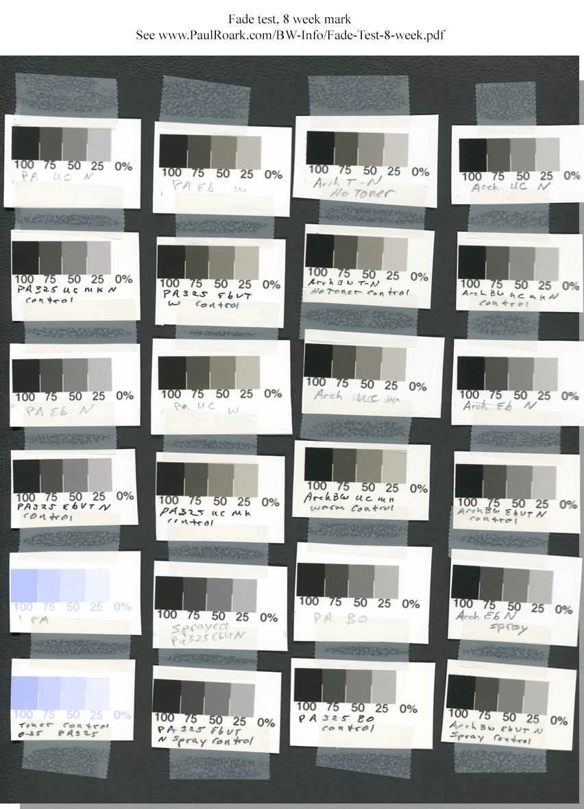
The longer answer: I';m satisfied, after my 8-week test, that the "new" Eboni is a solid carbon pigment, as was the old. While I have been told they are the same, there were clearly some differences. So, I needed to check it out in a fade test.
While most of the differences were positive -- like better dmax and less settling -- the Eboni v. 1.1 is slightly warmer. That was the incentive I needed to take on the problem of making a toned print that would meet the quality standards I wanted.
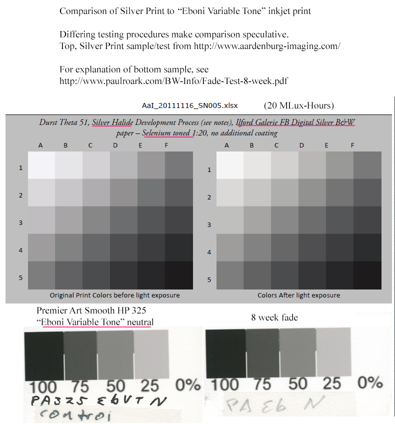
While I don't want to make over the top, "apples and oranges" comparisons, and it's still early in my testing, I think with the new toner I am testing we might have a neutral inkjet print that can take on the silver print. Your 100% Eboni on Premier Art 205 sample, tested by Mark at
http://aardenburg-imaging.com/, proved that for warm prints we can do it. Now I9;m trying to take that success to neutral prints as well.
For better of worse, comparisons to AaI&A tests are going to be inevitable. (I'll try to improve the ability to do that with the next phase of my testing by putting in some ink-paper samples that are exactly the same as what Mark tested.) For now, my best estimate is that the 8-week test is, I hope conservatively, close to AaI&A's 20 MLux-Hours level, though the variables will always be such that it's chancy. At any rate, FWIW, you might be interested in the Eboni Variable Tone neutral print on Premier Art 325 test compared to the selenium toned silver print, screen grabs reproduced here:
Your eyes can be the judge.
The key to the "new" Eboni "Variable Tone" (aka old/original UT1) approach is the single, very dilute blue toner. That allows both different carbons to be use, different toners to be used, and it avoids some of the ink separation issues we experienced with the carbon + color pigment neutralized inksets. I think the carbon + separate toner gives a flexibility in both print tones and ink setups that is missing in the neutralized carbon ink approaches. It won't be quite as "EZ" as the blended, neutral monotone approach, but for many of us, the flexibility is well worth the trade-off.
While I9;m currently focused on the Epson C & Canon Blue toner mix, you can be sure I'll be testing other combinations that look promising, and I';ve encouraged MIS to make a toner from its new color pigments, where they appear to have done a very good job of matching the C and M fade rates to avoid the green shift we experienced with the older third party color pigments.
I have no idea if MIS will commercialize my current approach. I think what is most important to the B&W field is a viable, independent "photographers' darkroom/inkroom" approach that frees us from the control of any one company. We should have competitive component suppliers. The success of the generic dilution base in dealing with pigments from MIS, Epson and Canon in my current approach will hopefully further demonstrate the extent to which we "darkroom/inkroom" practitioners can mix and match our inputs.
I might add that the approaches for the 1400 family (
http://www.paulroark.com/BW-Info/Eboni-Variable-Tone.pdf) and the 3880 will be Epson driver compatible. While I doubt I or most on this forum think all that highly of the Epson driver, there is a large group of photographers who want that compatibility. The Eboni VT approach will, hopefully soon, allow photographers to knock out 16x20 inch, neutral or warm B&W prints easily with a desktop printer that has a mere 27x15 inch footprint (3800/3880 -- soon to be readily available on the used market as the color folks move to the new Epson P800 due to its better pigs and roll paper adapter), using QTR or simply an ICC with their standard Epson driver workflow, from either Mac or PC platform. While they can currently make reasonably good ABW prints, we'll be able to make better ones far less expensively.
Paul